YUME'S REBRAND
YuMe, a company once focused on creative media solutions, sought to rebrand its logo to reflect its evolution into a more professional, business-oriented brand.
Challenge:
The original logo, with its playful colors and design, no longer aligned with the company’s growing, broader services.
Solution:
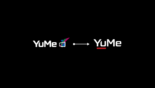
Typography: The rounded, friendly font was replaced with a sharp, angular typeface to project professionalism.
Color Scheme & Icon: The colorful, dynamic elements were simplified, and a bold red underline was added to communicate confidence and maturity. The TV icon was removed to suggest expansion beyond media.
Outcome:
The new logo positions YuMe as a more sophisticated, versatile brand, appealing to a broader, corporate audience.
Conclusion:
YuMe’s rebrand effectively signals its growth and transition from a youthful, media-focused company to a professional, diverse business.